Does Google See Your Website As Mobile-Friendly?
Major changes took place in search engines. They now give search ranking preferences to mobile-friendly websites. Is your website mobile-friendly?
Why is Mobile-Friendly so Important?
Last year, a comScore report stated that mobile (smartphones and tablets combined) account for 6o percent of all online traffic.
While Google has not said the exact percentage, it is estimated that 50% of Google searches come from mobile devices.
- Your customers are searching on mobile, so your website should look good on their devices.
- Google has always aimed to give the most relevant results, so starting April 21, mobile-friendliness will be used as part of the ranking criteria. Google announced, “This change will affect mobile searches in all languages worldwide and will have a significant impact in our search results.”
- Therefore, with half the searches coming from mobile, if your site is not mobile-friendly, you may lose half of your traffic after April 21.
Mobile-Friendly Test

You may have noticed when searching Google on mobile, they show “Mobile-friendly” in the search results for the sites that pass their test.
If your site is not mobile-friendly, it’s time to take action. You can test to see if your site is mobile-ready with Google’s Mobile-Friendly Test
The Options: Mobile-friendly vs. Mobile-responsive?
A mobile-friendly site is a website where the content is shown in a way that is easy to read on mobile devices. There are multiple ways to accomplish and meet Google’s requirements while creating a better user experience for your mobile visitors. Google stated that responsive design is their “recommended design pattern,” but they do not favor any particular mobile format in search results.
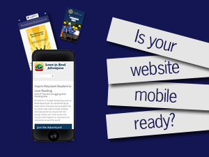
In some cases, there can be reasons to maintain a separate site for mobile and desktop users, but in most all cases, we (like Google) suggest mobile-responsive designs, which serve the same HTML, but display the site differently based on the screen-size. You can find a few examples of mobile responsive websites at Civitan International, Learn to Read Adventures and FusionHealth.
Civitan International

Learn to Read Adventures

FusionHealth

Options for Websites on a CMS Platform, such as WordPress
First, check to see if there are any available updates for your theme. After updating, if the theme is still not mobile-friendly, there are two main options available:
1. Add a Plugin to Detect Mobile Browsers
For those looking for a quick solution, you could add a plugin such as WP Touch. With this set-up, your site would maintain its current version for desktop users, but would display an alternate mobile version for mobile users. After installation, you can configure the plugin to have your site’s colors. Be aware that these plugins convert content from the WordPress database, so if your site has a custom-designed homepage, it may not convert properly.
2. Add a New Mobile-Responsive Theme
Typically, a better solution is to add a mobile-responsive theme. Some of these are free and some are available for purchase. Or, you could have a web designer create a custom theme for you to mirror the look of your existing theme or a new look you desire. After installation, you will need to customize and configure the new theme to make sure everything from your current site displays correctly in the responsive theme.
For those with static (HTML or hand-created) websites
1. Add a Mobile-Only Option
For a quick solution, you could purchase a package with a mobile website company. This would involve keeping the site as is for desktop users and paying a mobile website company a monthly fee to detect mobile browsers and direct users to that separate mobile site. This would require maintaining two sites and we typically do not recommend this route.
2. Create a Responsive Site
Typically a better solution is to create a responsive website. You can do this in two ways:
a. Use a Platform to Create a New Responsive Site
In this case, you could use a platform, such as WordPress or Squarespace to create a responsive site. In WordPress, you would select a mobile responsive theme or have one created for you. All Sqaurespace themes are mobile responsive so you could select the one that works for you. As before, any option will likely require customization to meet your exact required look.
b. Convert the Existing Site to Mobile Responsive
This option would require web design knowledge, but you can code the current site to be mobile responsive or a web design professional can assist you with this option.
Website management can feel like exploring countries where you don’t speak the language, but RevStream Marketing has been helping clients navigate their way through the web-world for years. We are happy to assist you with any questions or design needs on your journey to a mobile-friendly website. Contact us here or call us at (404) 828-0520.
Feedback
Comments: 1
Hunter
April 15, 2015 at 1:41 pm
This is helpful information for our followers who include parenting bloggers. Most on-the-go families are using their mobile devices almost exclusively and it’s always frustrating as a user to experience an outdated website that doesn’t fit to the screen. Thanks for sending out an important update.